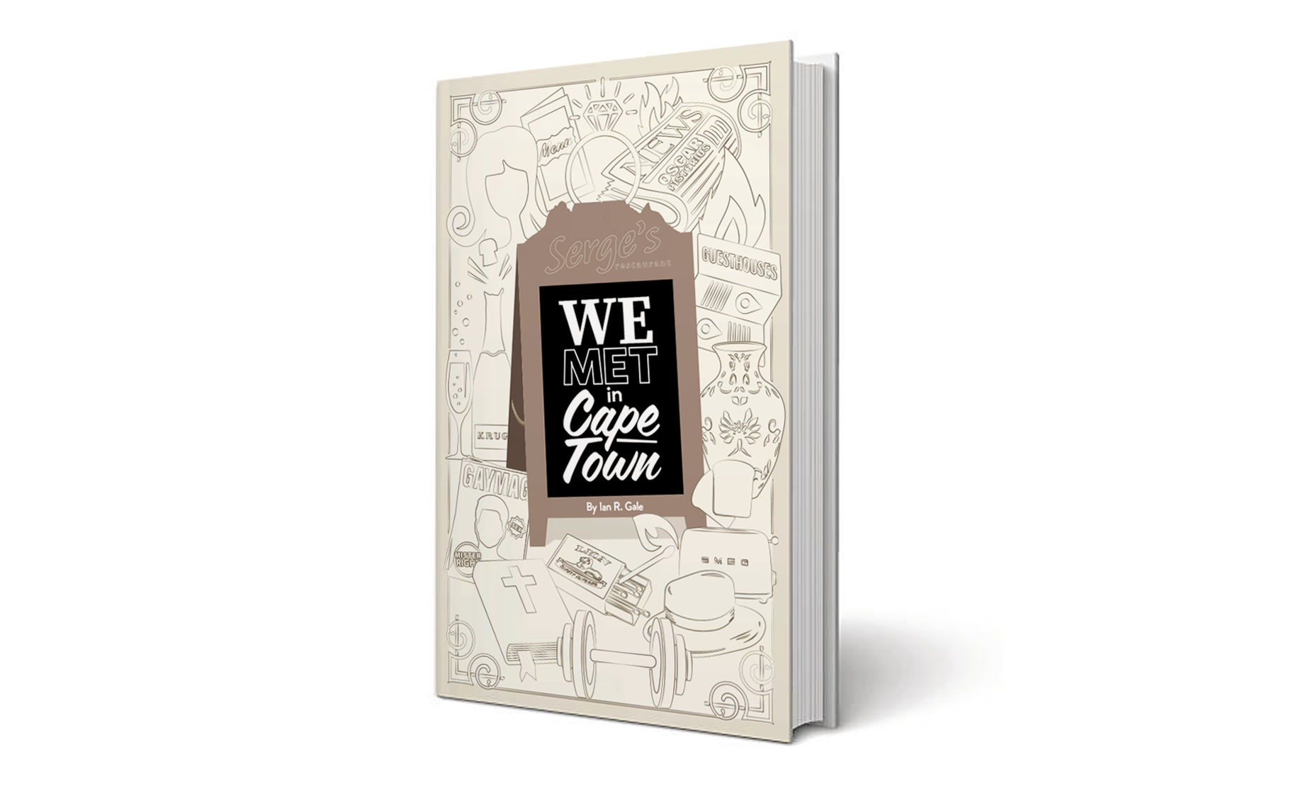
We Met in Cape Town
___________________________
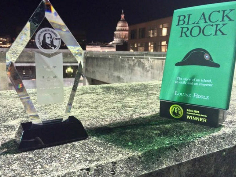
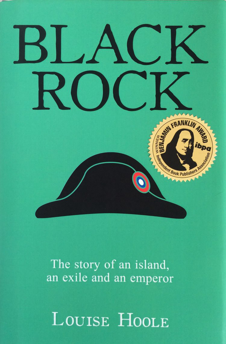
Black Rock (Cover and Title Pages Design)
Gold winner for best design at the IBPA Benjamin Franklin Book Design Awards in the United States.
The story revolves around the death of Napoleon on St Helena Island, told from the perspective of his ghost.
INSPIRATION
Colour:
The green was inspired by the fact that Napoleon had his autopsy performed on his billiards table, and the colour of the wall in his living room was also green.
Colour:
The green was inspired by the fact that Napoleon had his autopsy performed on his billiards table, and the colour of the wall in his living room was also green.
Graphic hat:
The main graphic is obviously Napoleons bicorne hat.
It also happens to create a similar silhouette to the shape of the island he was exiled on, St Helena.
The main graphic is obviously Napoleons bicorne hat.
It also happens to create a similar silhouette to the shape of the island he was exiled on, St Helena.
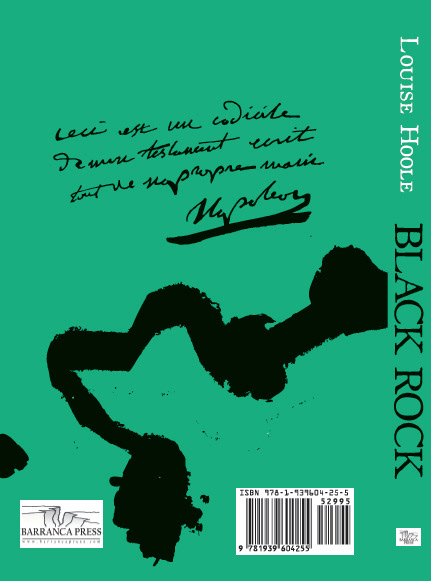
Black splotch on the back cover:
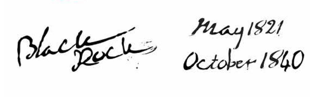
I received scans of actual letters and manuscripts written by Napoleon. As he got more ill his handwriting became increasingly illegible and he often spilled ink all over the pages. The back cover is a graphic representation of an actual letter he wrote with ink stains.
I received scans of actual letters and manuscripts written by Napoleon. As he got more ill his handwriting became increasingly illegible and he often spilled ink all over the pages. The back cover is a graphic representation of an actual letter he wrote with ink stains.
Typography:
Based on these same letters and manuscripts I developed a type face from his handwriting. This was used for chapter and title pages.
Based on these same letters and manuscripts I developed a type face from his handwriting. This was used for chapter and title pages.
(Author: Louise Hoole)
___________________________
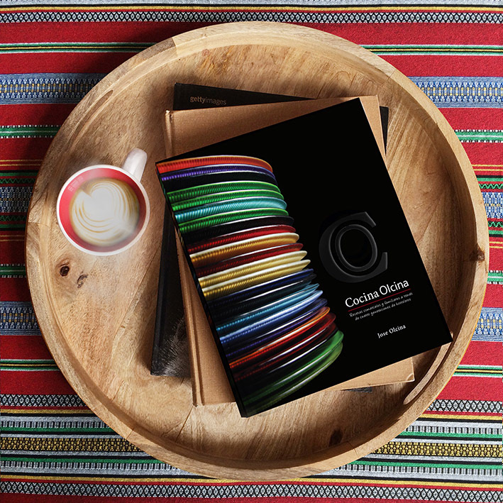
Cocina Olcina (Spanish Cooking Book)